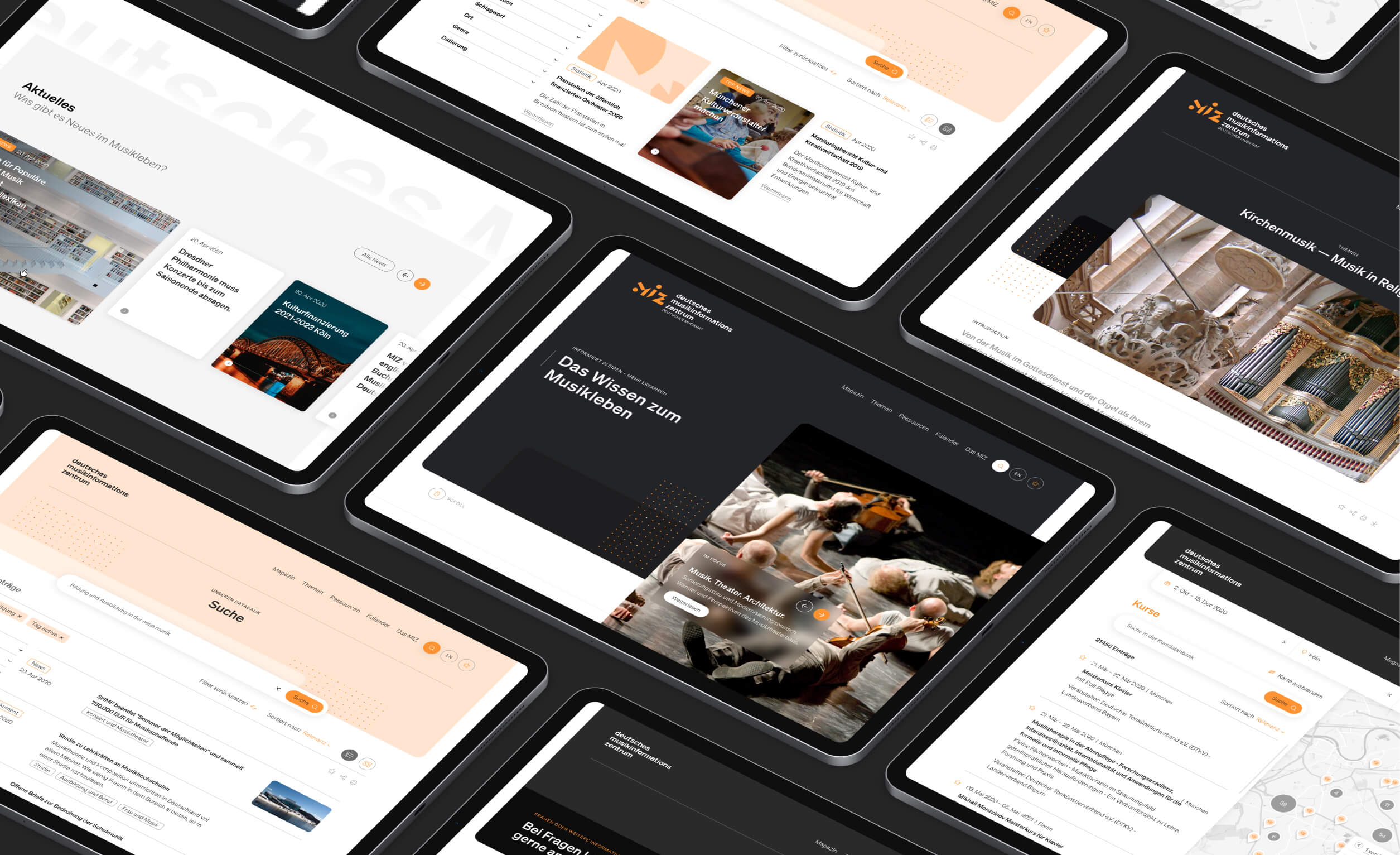
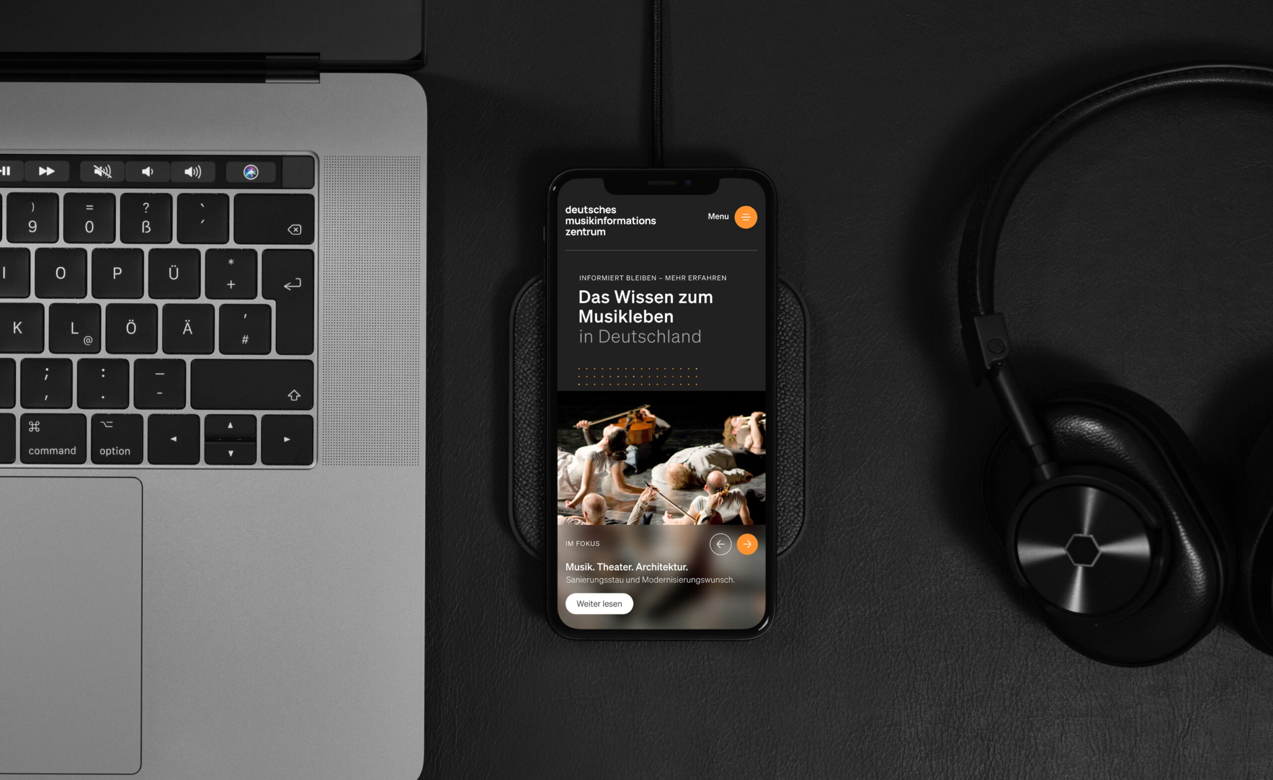
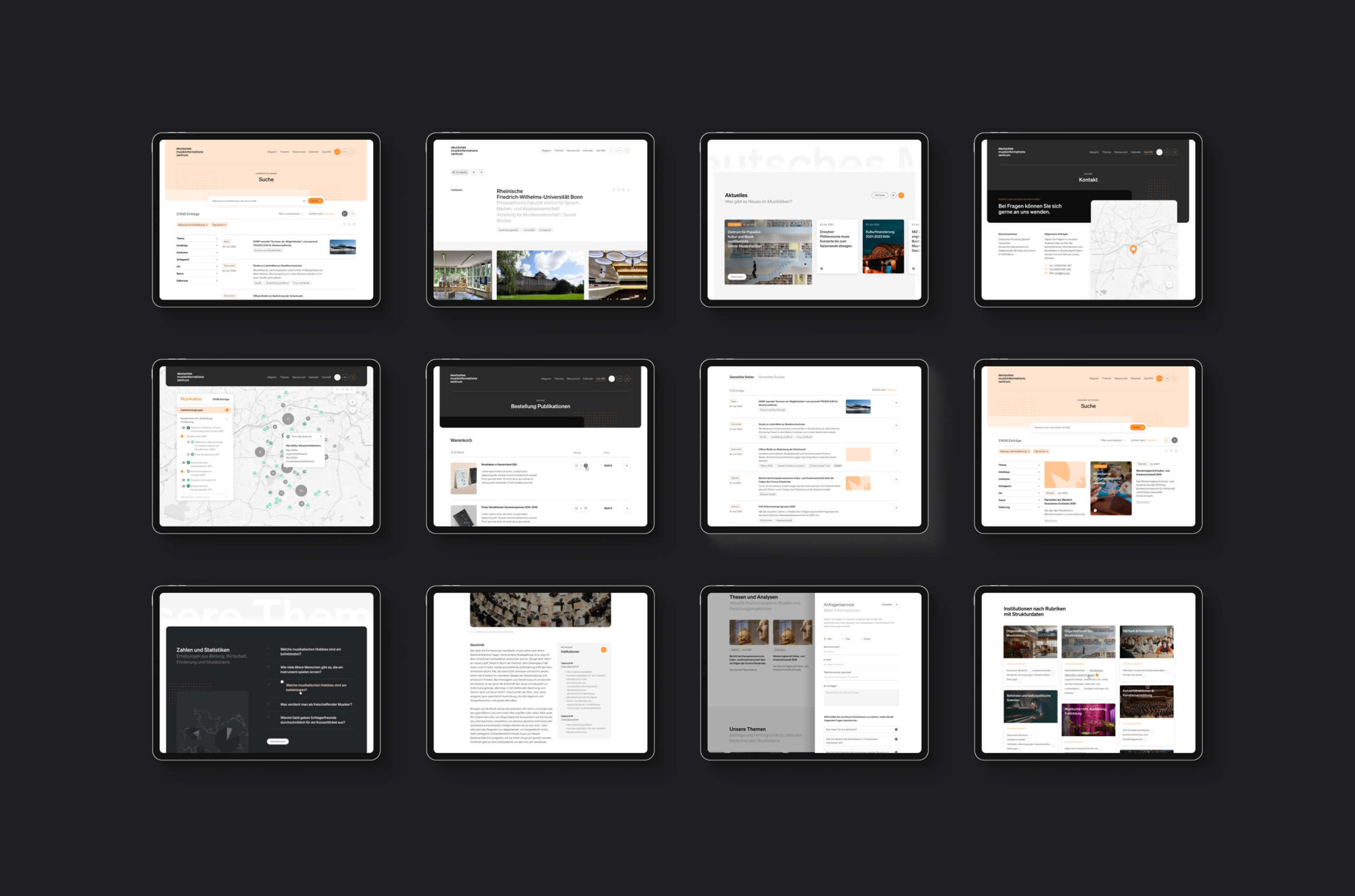
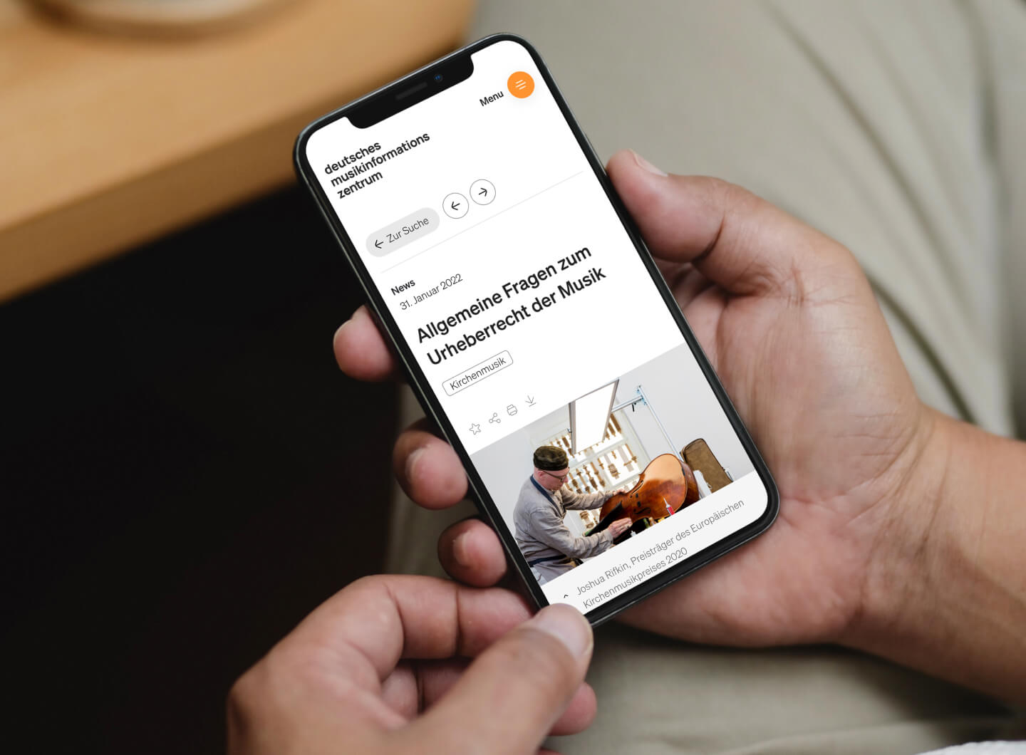
The new website gives insight into a vast amount of articles, statistics, news, courses, documents and over 11,000 institutions. It was important during the design process to make sure every kind of content became easily accessible. Finding localised information, courses and musical lessons close to home was also made possible with the implementation of a map layout navigation system.
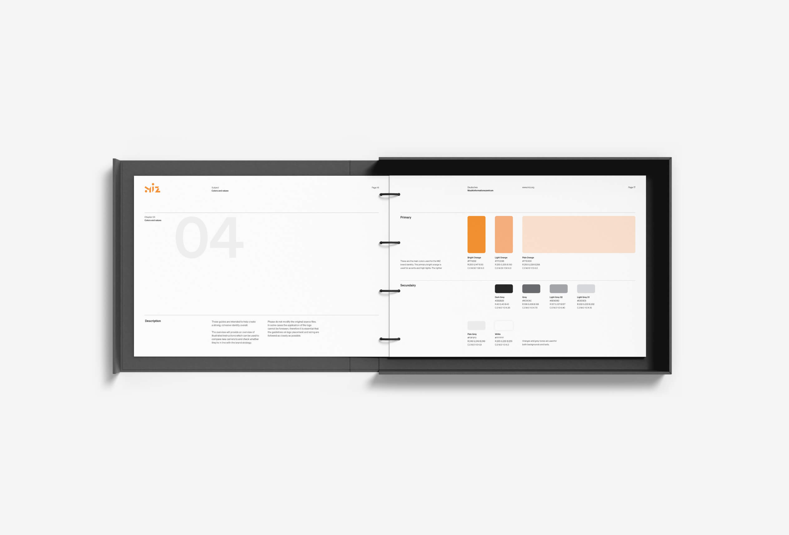
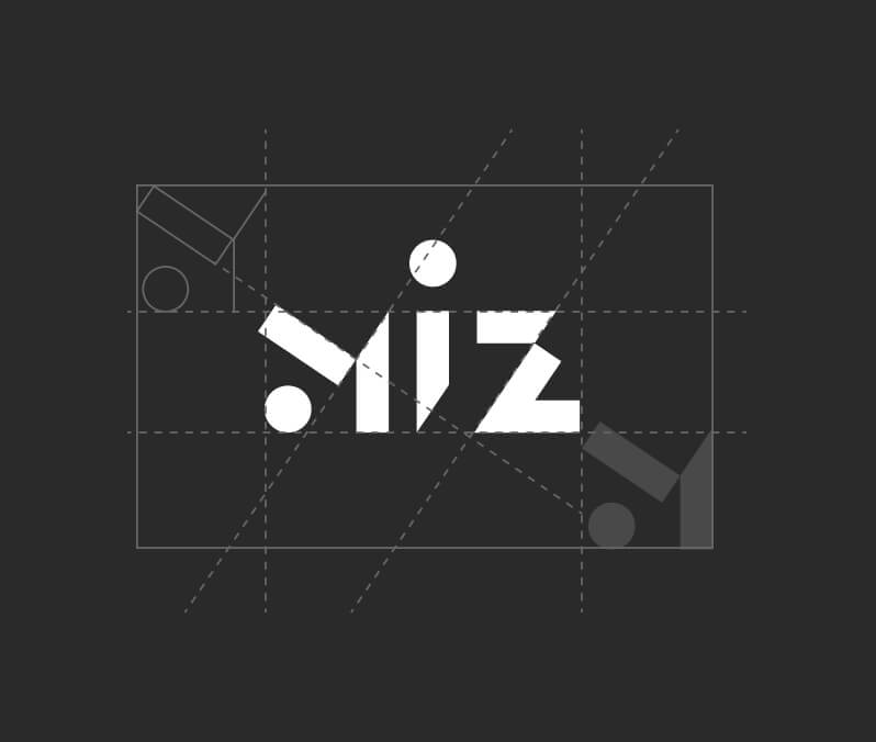
Naam created a new visual identity for MIZ to ensure a coherent and recognisable brand experience throughout both print carriers and the website. With patterns, icons and a fresh set of colors we build upon the legacy of the brand.


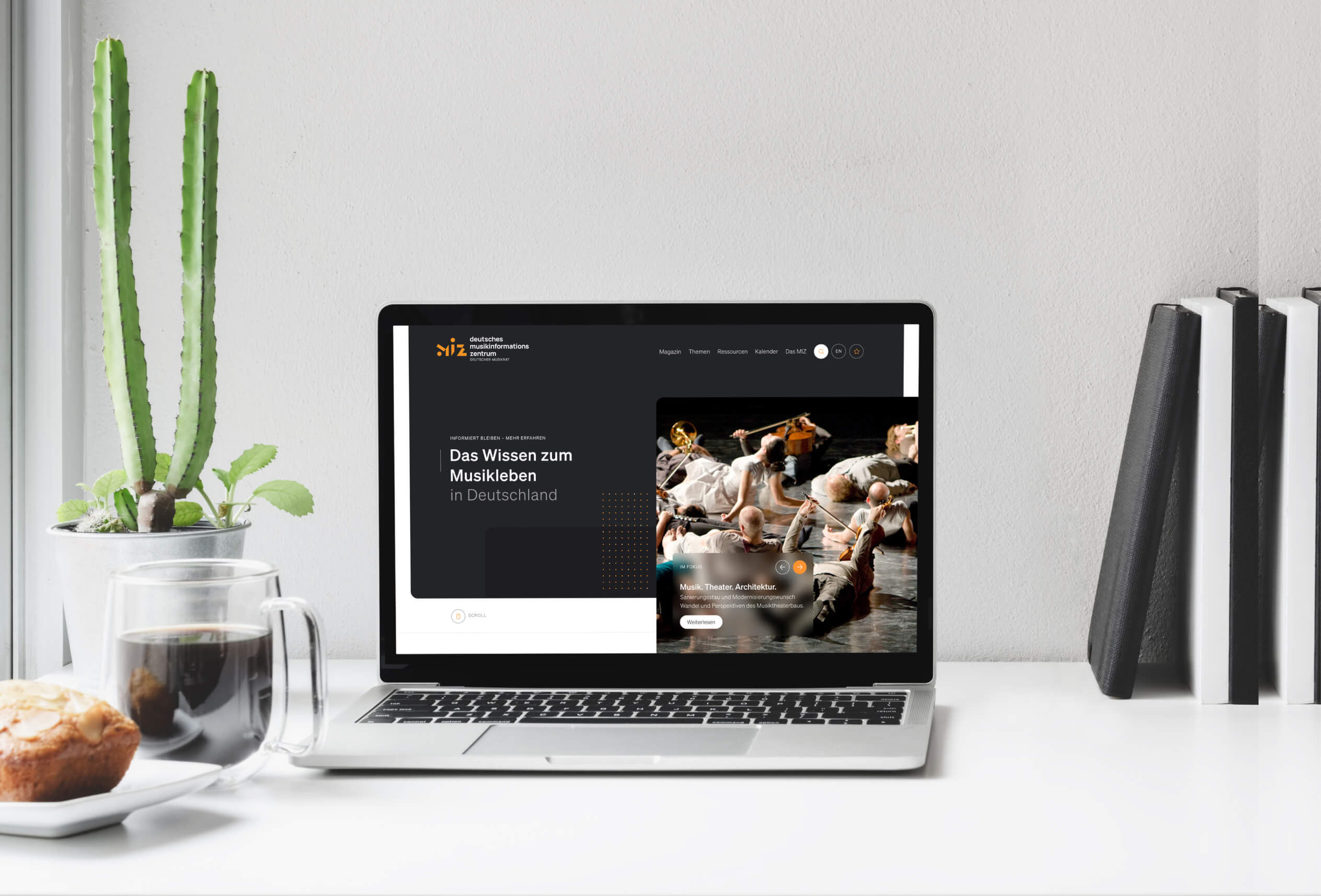
Each page and module is created with flexibility in mind. MIZ is able to set up new pages and flows themselves to test, iterate and optimize. This ensures that the website will be ready for the next 25 years of data to be collected and included into the online platform.


The heart of the website is built around a solid search engine to make all information accessible. Whether it is an in-depth focus article or a statistic, via smart filters and an omni-search the visitor is just a couple of clicks away from their matching result.

In the process of designing the visual identity, a clear foundation has been laid for print carriers. Every touchpoint with MIZ’s audience is translated into the same recognisable visual style. This applies to their publications, infographics and stationary for example.
Various additional carriers will be developed in the near future, matching up with the same values and visual language.
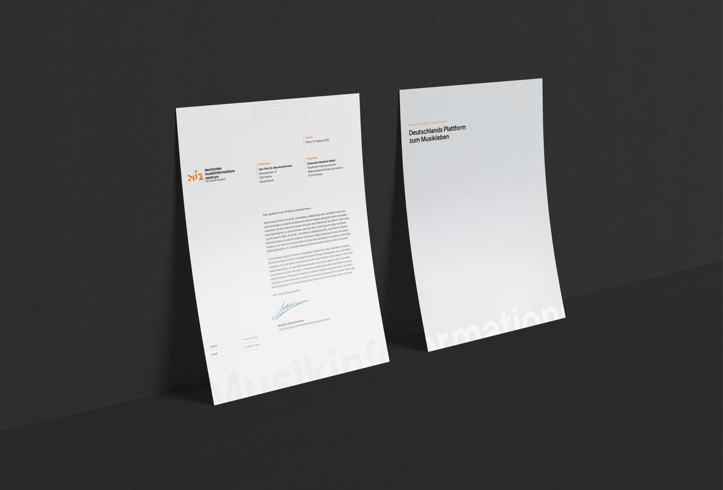
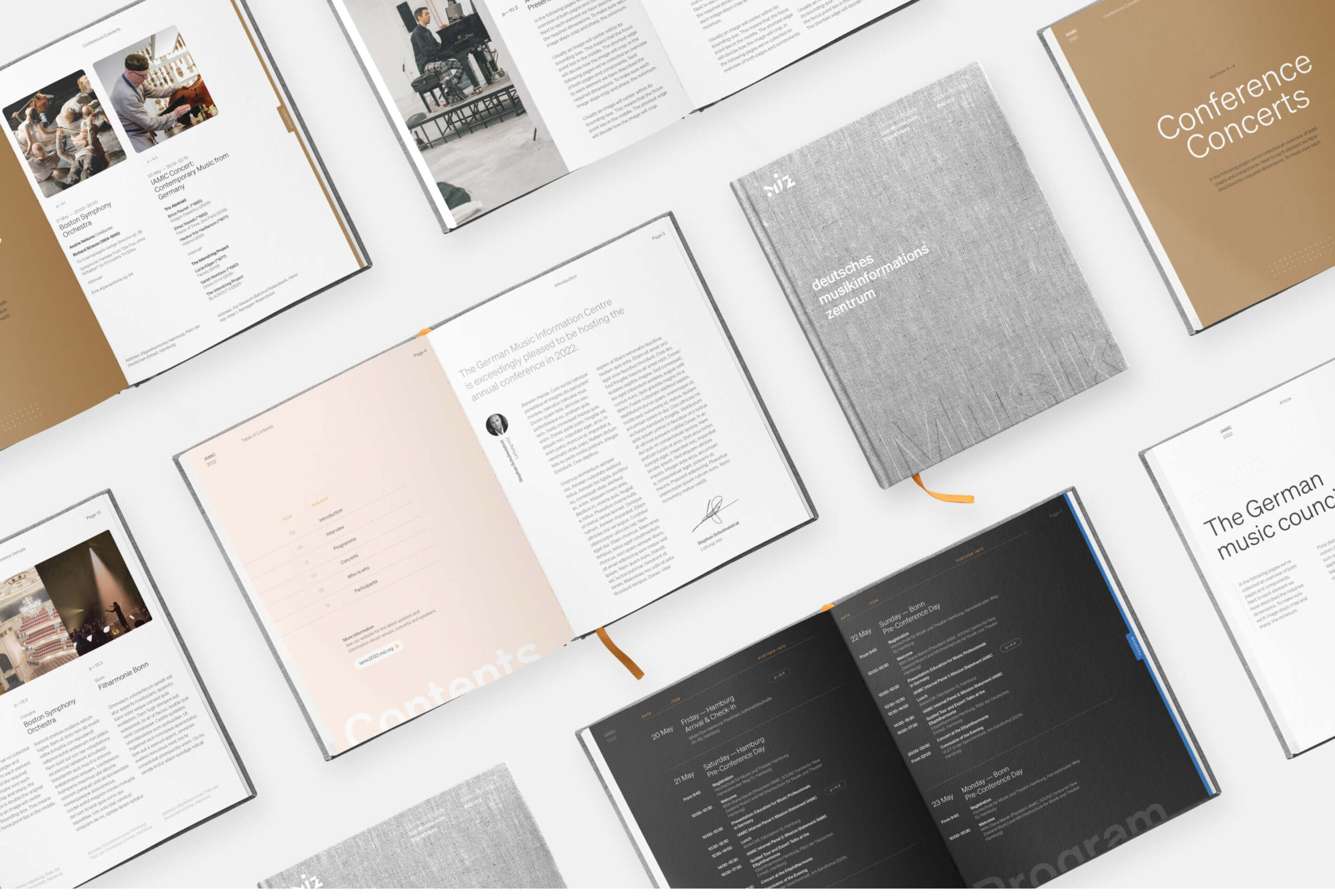
Customized brand guidelines create a set of rules on how to use each stylistic element of the MIZ brand identity, both as separate components, and in combination with each other. We create these for our clients so that they have all the tools they need to continue to build up their brand.
