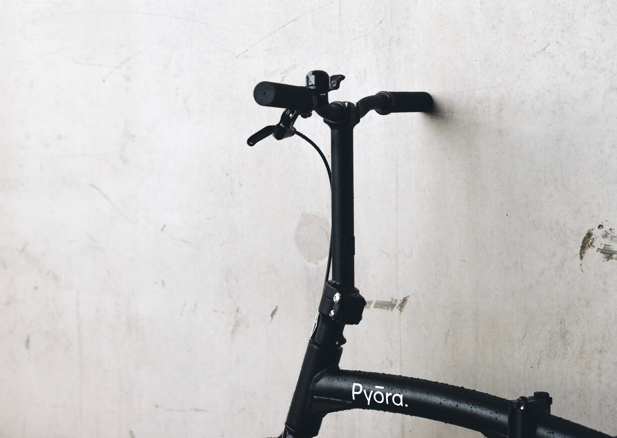
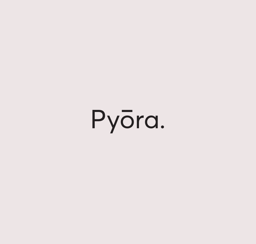
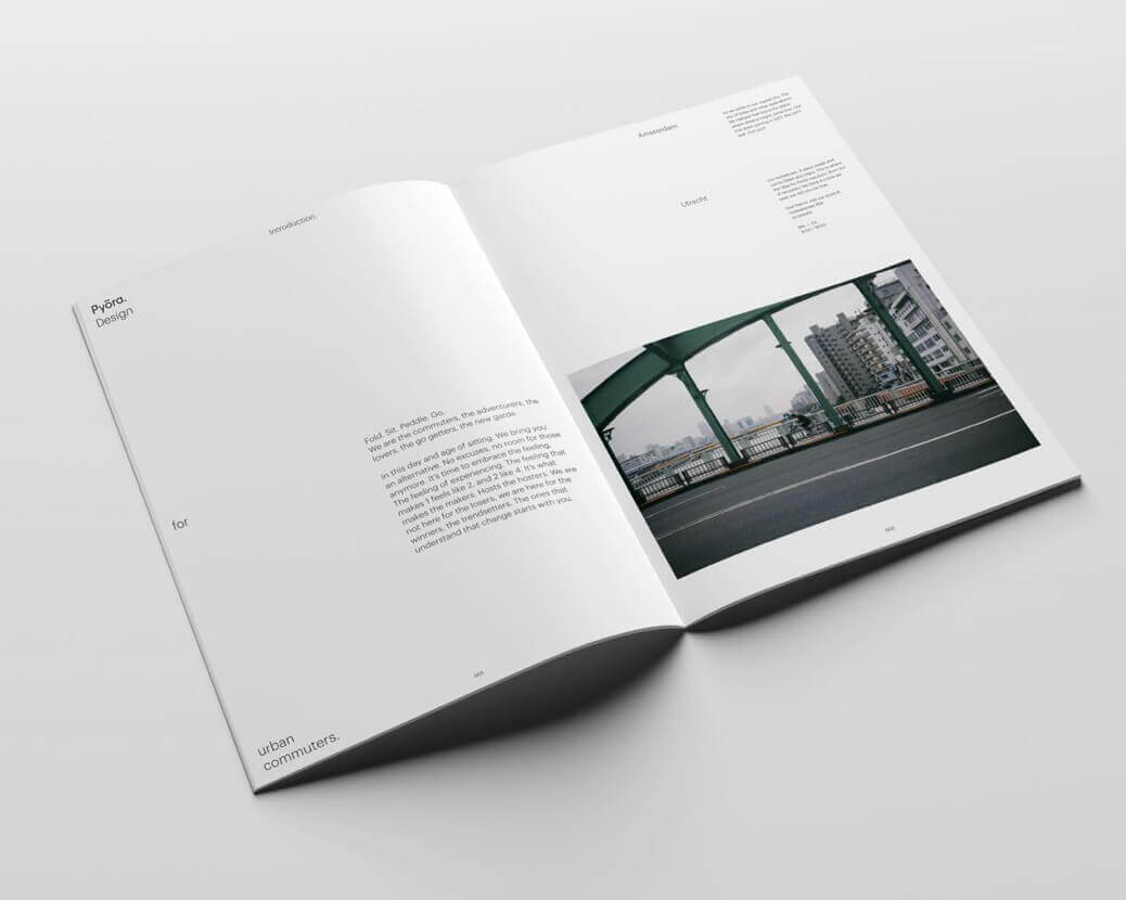
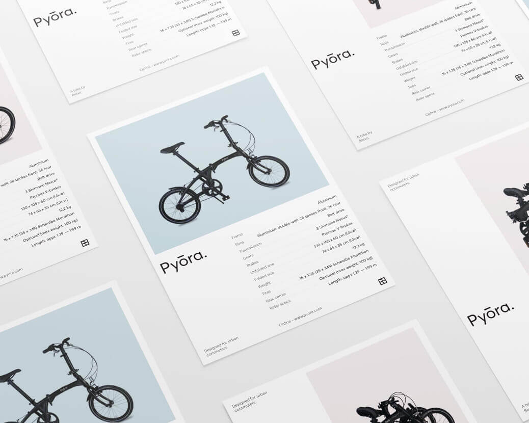
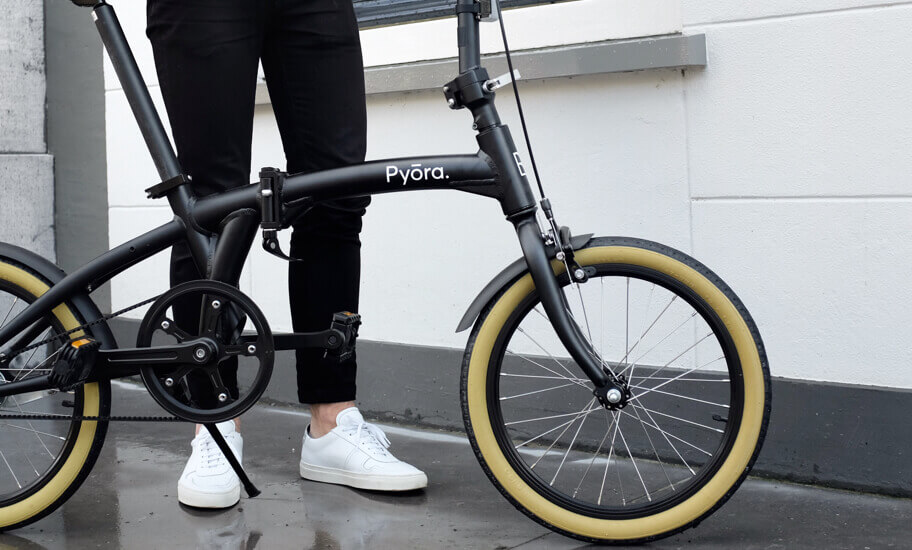
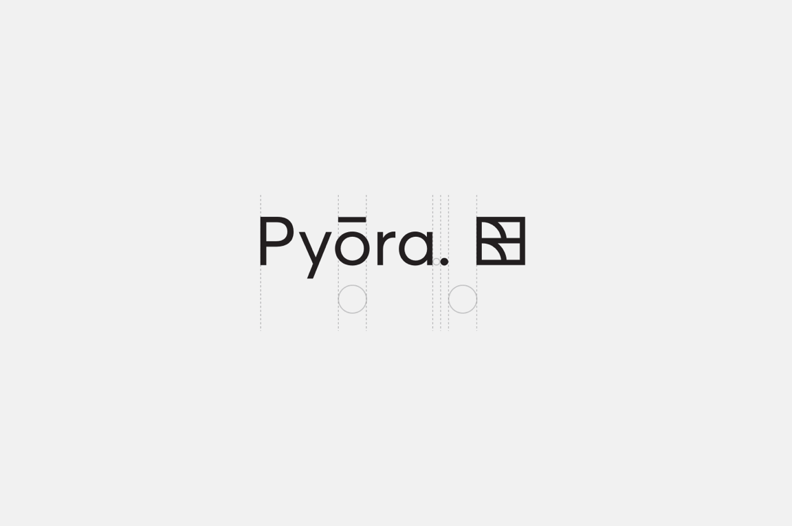
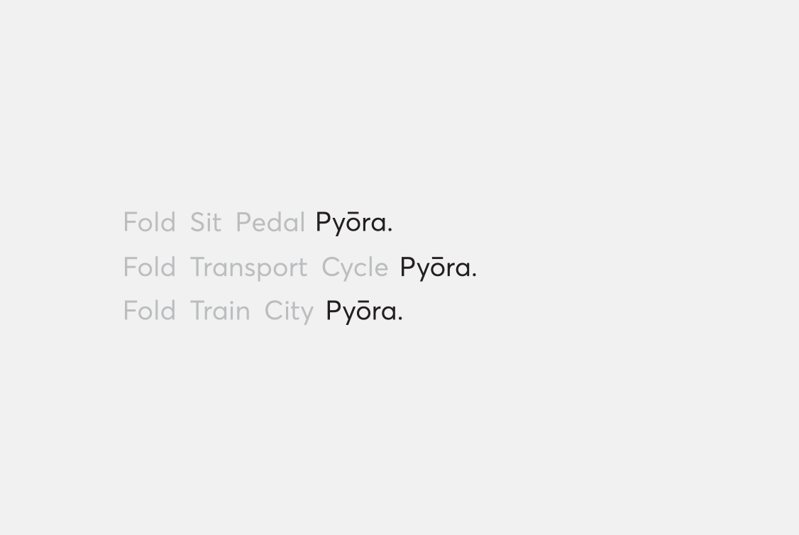
With the clean cut and modern bike design as our inspiration, we created the Pyōra brand. A simple, but memorable, modern brand for a modern company.
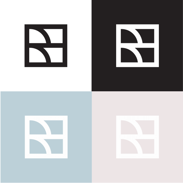

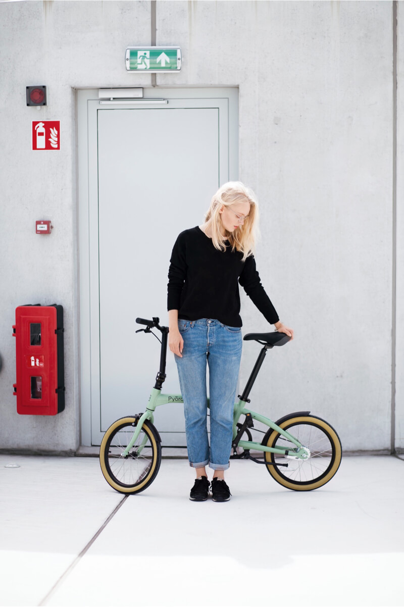
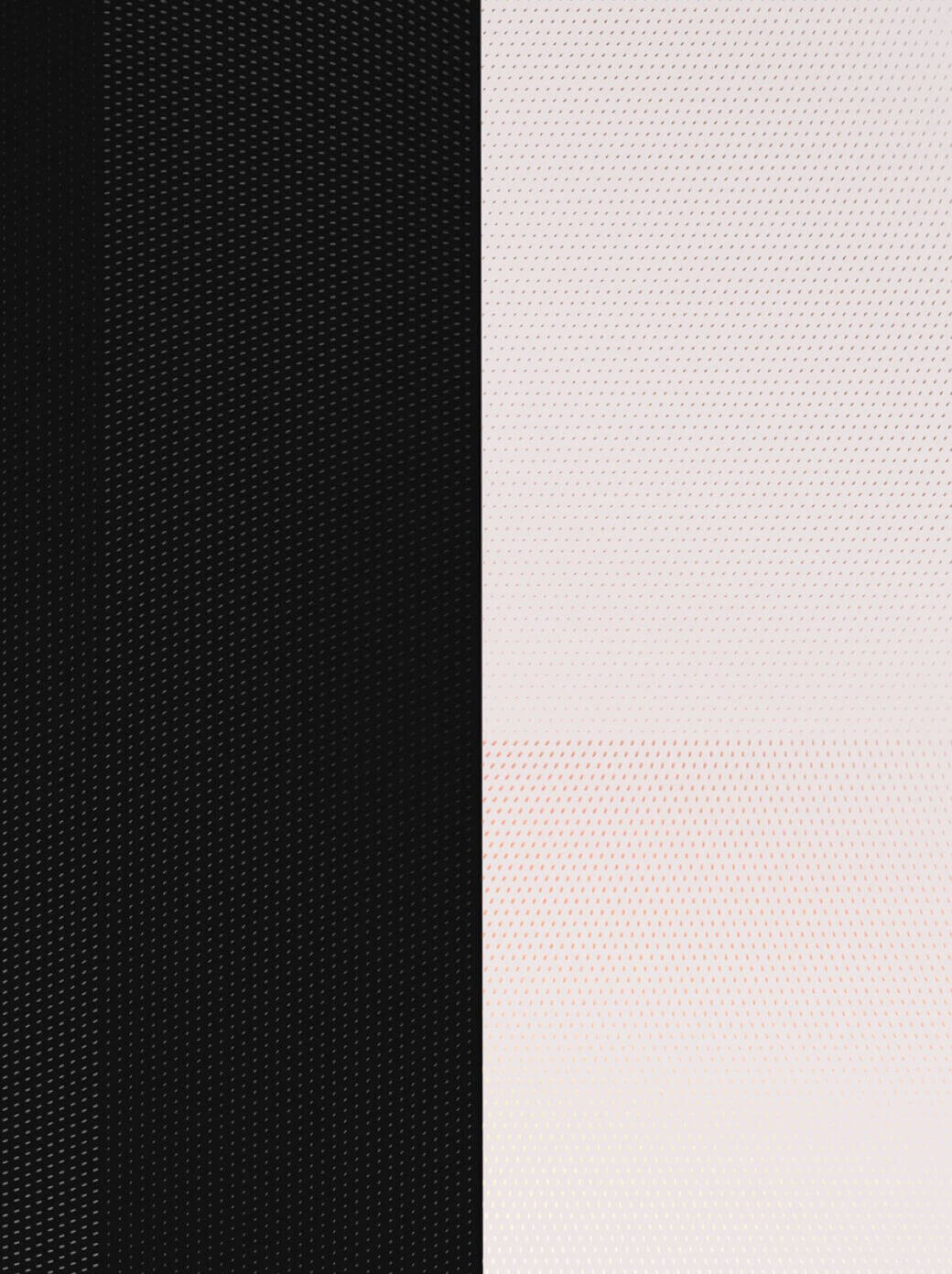
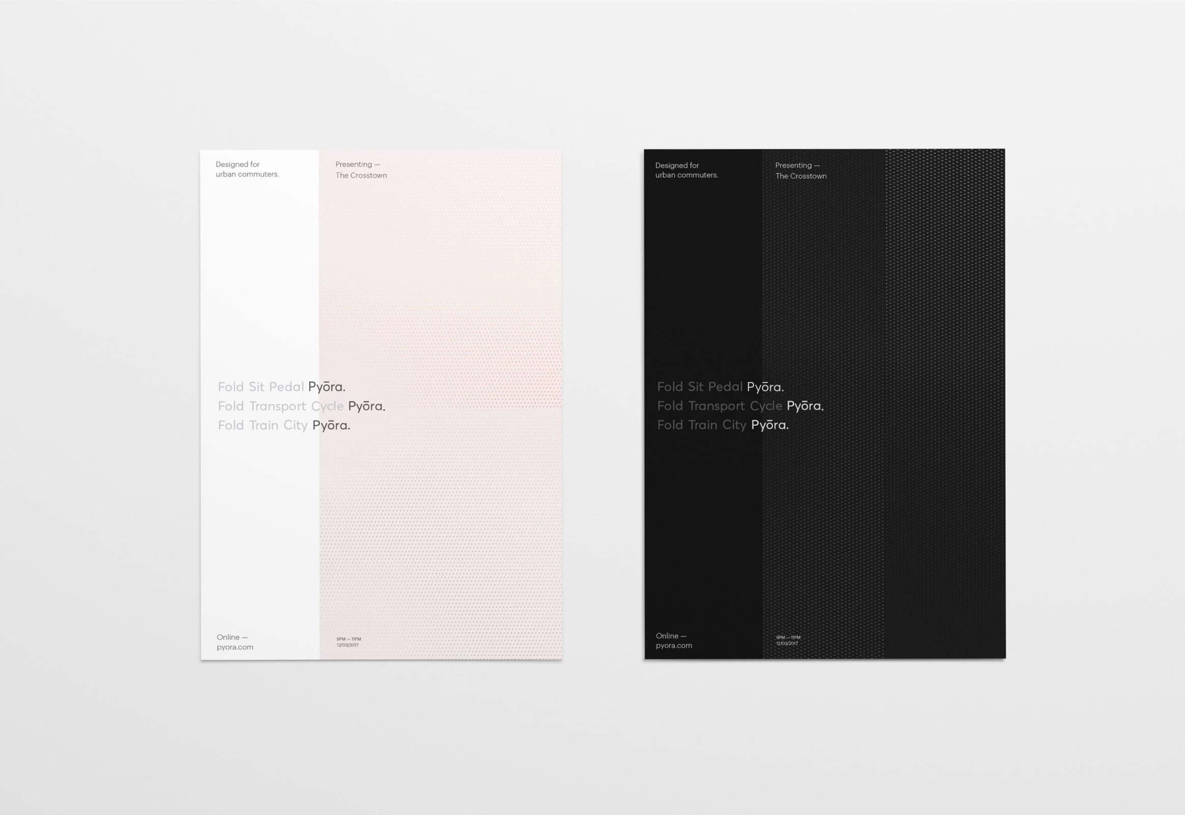
Subtle pastels set Pyōra apart visually from their competitors and creates a sense of calm in an otherwise busy urban environment. The company resonates a playful atmosphere that we incorporated into the brand. Clean cut visuals give it a friendly face which translates well into print and digital applications.

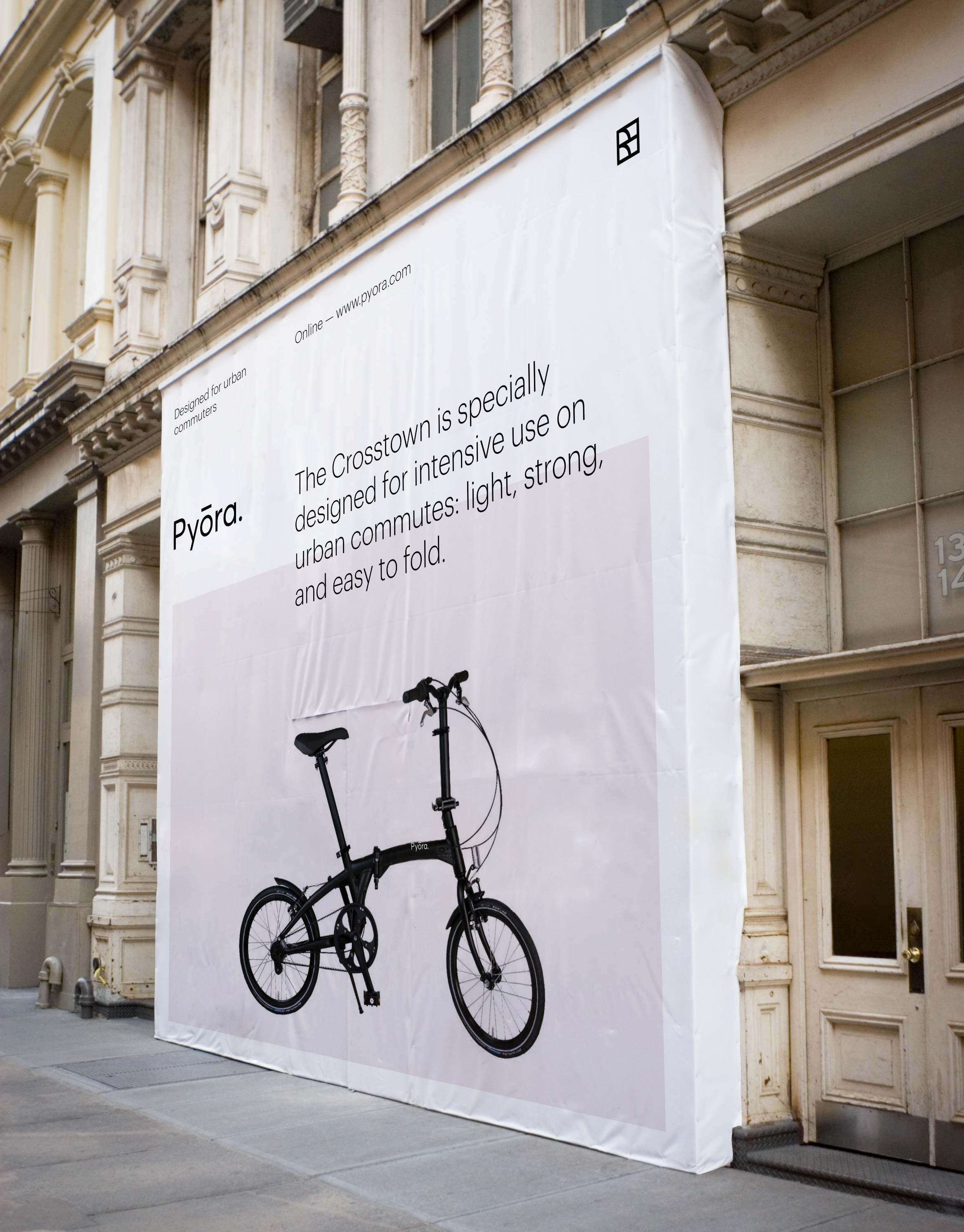
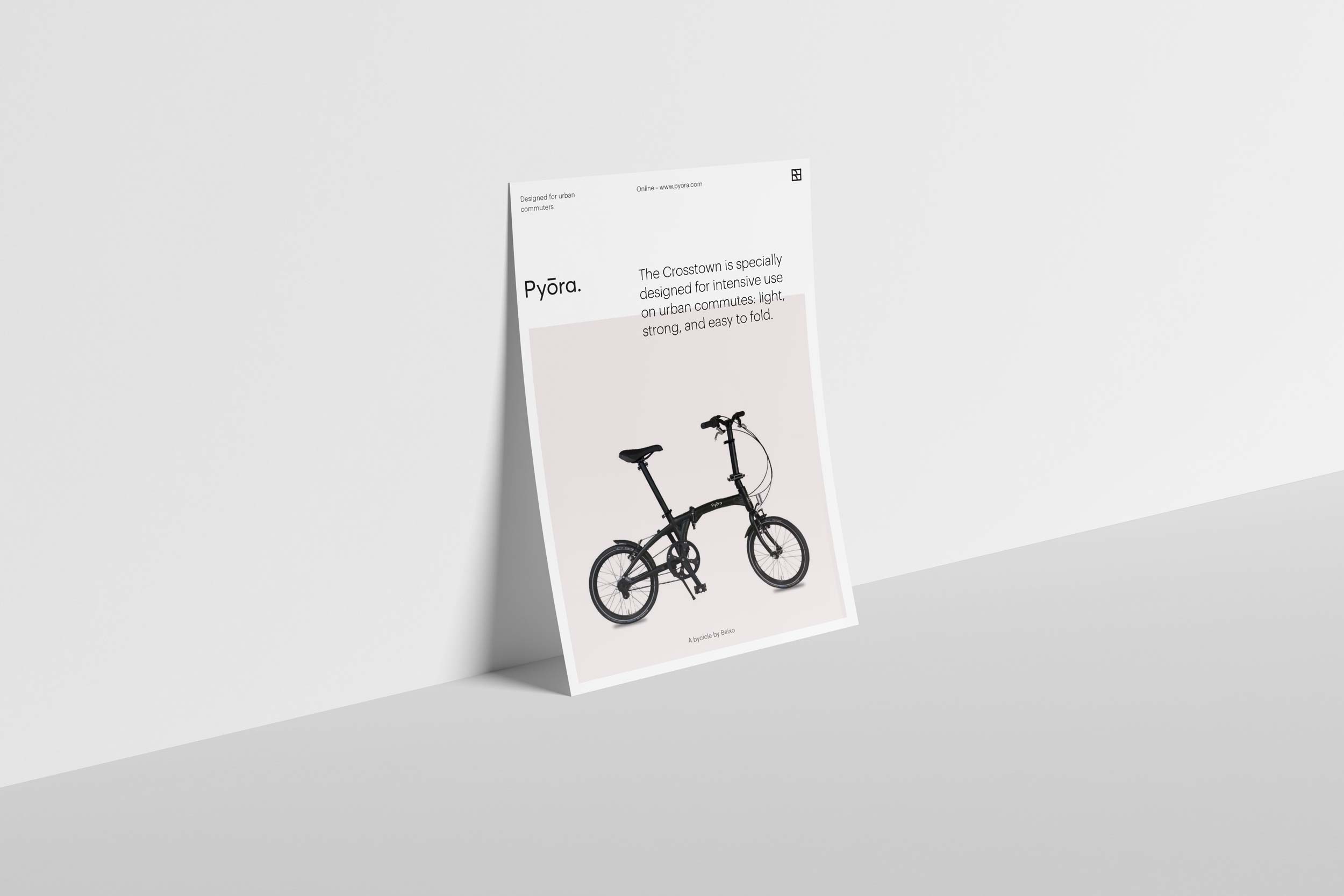
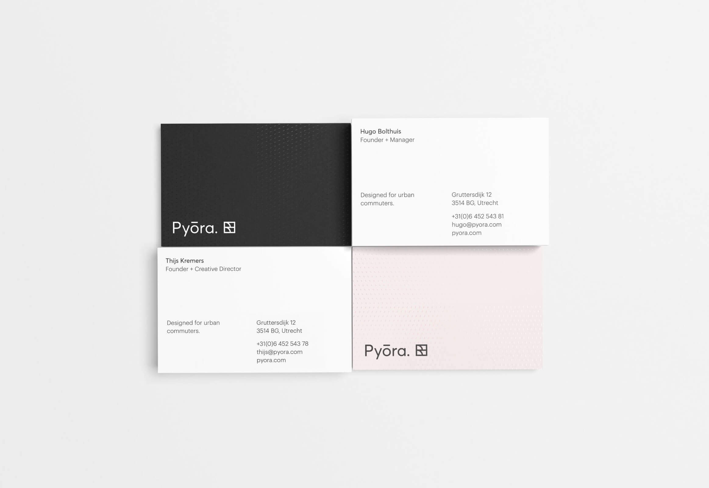
The Pyōra brand is highly flexible through a mixed use of color, tone, logo, pattern, and layout. We helped assemble a brand-toolkit, containing many different components to keep consistently producing beautiful mixed media across a range of print and digital.
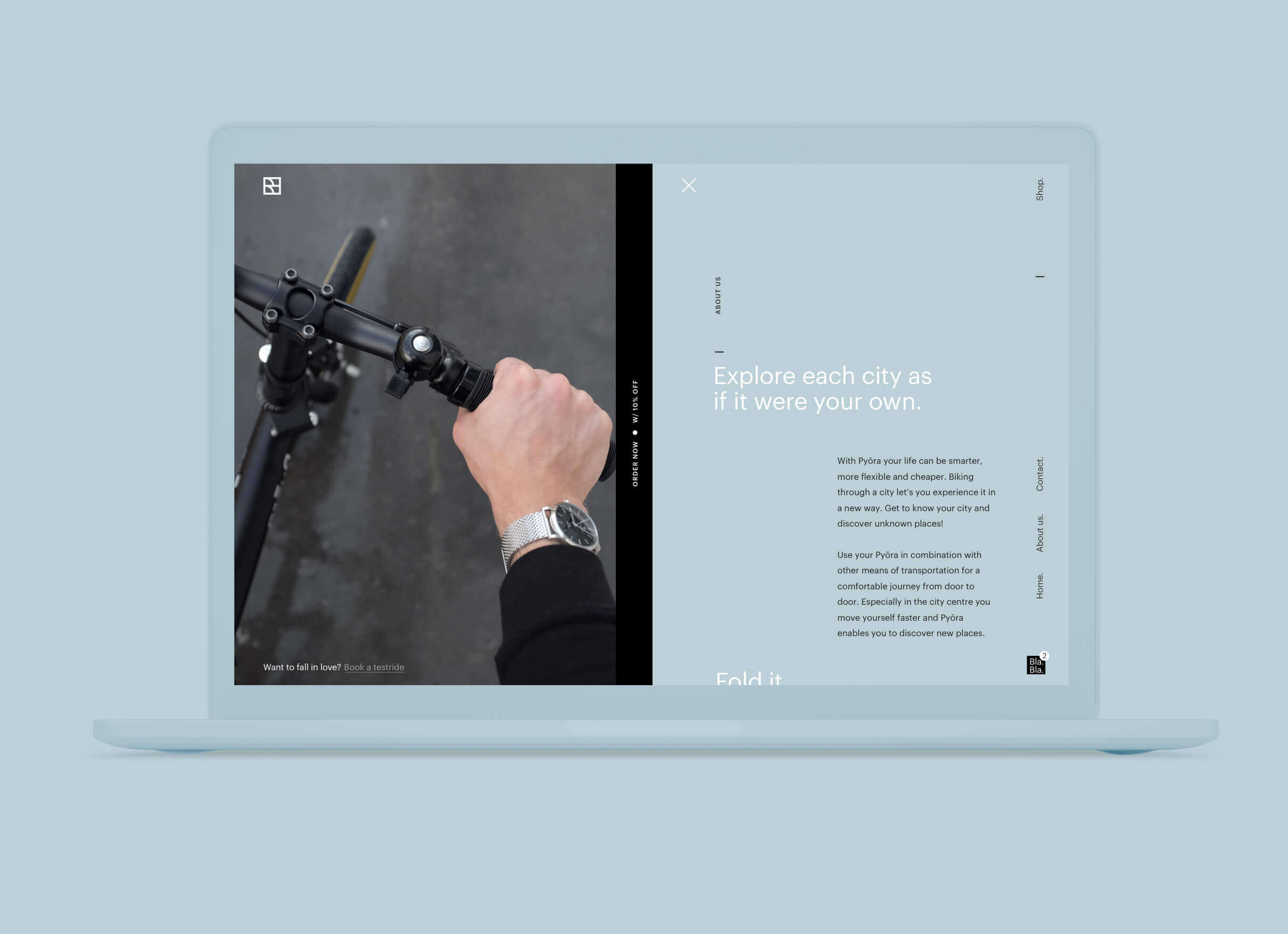
We translated the brand's new language into a website as dynamic and colorful as the bikes themselves.
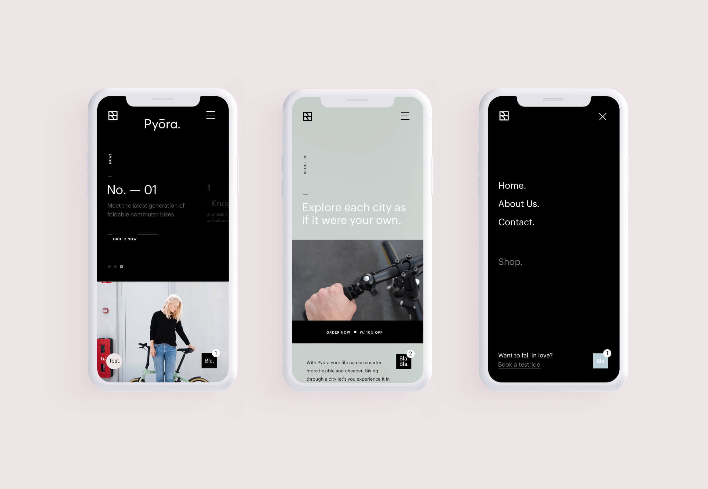
The website is responsive by design and easily scales to work on any kind of screen, anywhere you go.
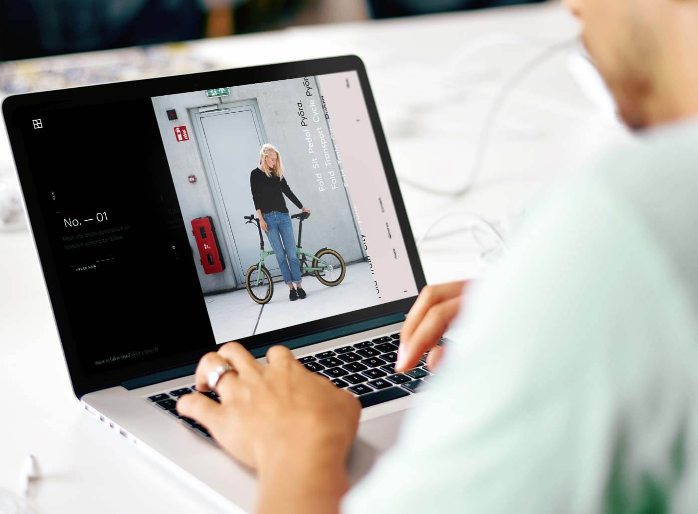
The design of the company page is inspired by the foldable design of the bike. With a clear division in the middle of the screen, and scrollable content on the right. It's a memorable page for a bike you won't easily forget.
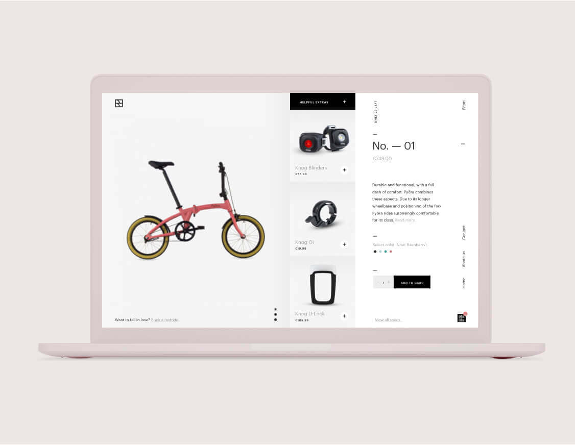
The website features a small e-commerce web shop with simple basket-to-delivery function.
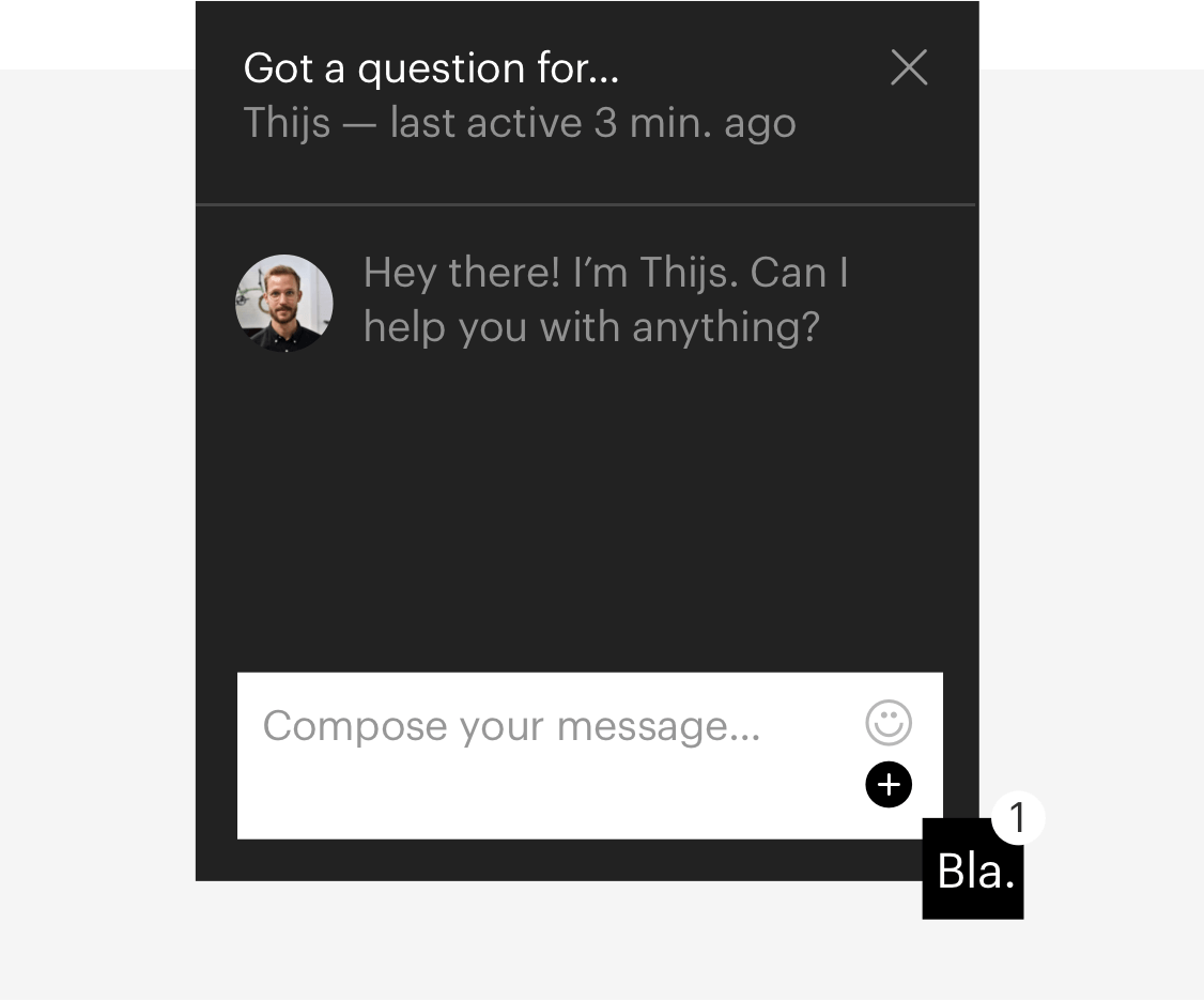
A built-in chat function gives visitors direct access to the company owners for questions and advice.
Customized brand guidelines create a set of rules on how to use the stylistic elements. We create these for our clients so that they have all the tools they need to continue to build up their brand.
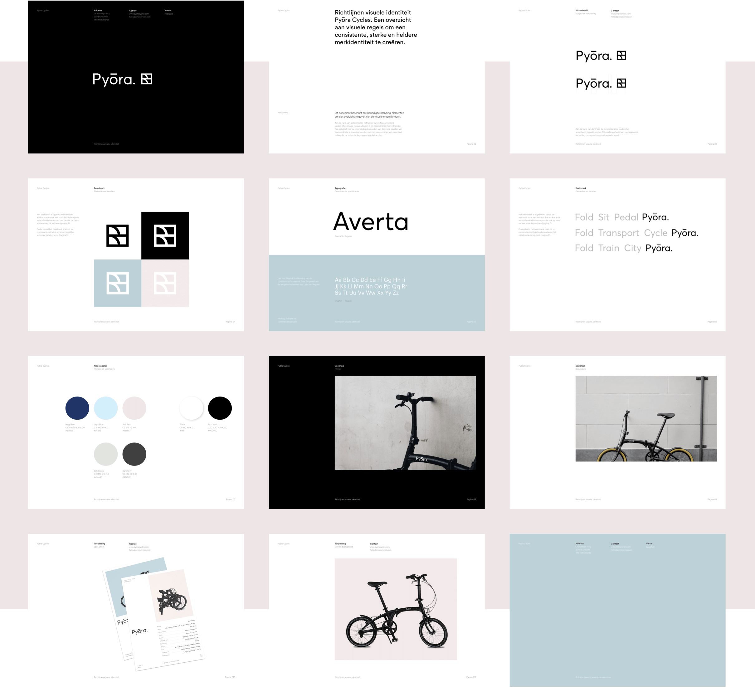
We gave Pyōra the tools they need to keep building their brand with a brand style guide. This acts like a set of rules and guidelines for the company to keep creating beautifully branded mixed media.